Overview
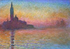
Claude Monet, “ San Giorgio Maggiore by Twilight,” 1908. A view of the monastery island of San Giorgio, painted from the south-eastern end of Venice.
The quest to find the perfect colors and color combinations is a common thread that runs from those who have painted great masterpieces and graphic artists to interior designers and landscapers. As French impressionist Claude Monet said, “Colour is my day-long obsession, joy and torment.”
Because humans assign colors to objects (like green leaves or red apples), we tend to think of color as a constant — even when we know that white wine can be yellowish or golden and that the blue sea can range from dark gray to turquoise. As Georgia O’Keeffe said, “I found I could say things with color and shapes that I couldn’t say any other way — things I had no words for.” We overlook the fact that color interpretation is a complex process that taps into our sensations and our moods, as well as our eyes, neurons, and brains. ColoRotate takes this complex process into account, in that its open 3D color space corresponds to how our minds truly perceive color. The result? ColoRotate can help you find the colors that fully express your vision.
You don’t need a theoretical understanding of color systems to use ColoRotate, but a little background information can help you be a better designer or artist. Pablo Picasso famously said, “Why do two colors, put one next to the other, sing? Can one really explain this? No.” While ColoRotate can’t explain Picasso’s conundrum, it helps take the guesswork out of choosing colors, enabling you to interpret color relationships and combine colors more clearly — regardless of your medium.